
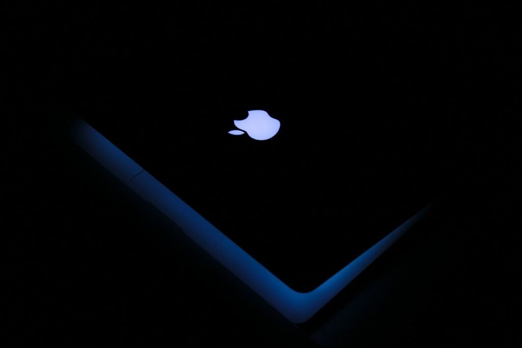
Logos with Apples – Apple Logo History, Design & Brand Lessons (2026)
Logos with Apples: The Apple Logo History, Design Meaning & Lessons for SaaS Brands
The Apple logo is not complicated. That is precisely why it works so well. In a world of over-designed marks and constant redesigns, Apple’s bitten apple has stayed remarkably stable while the company itself transformed from a computer maker into one of the most valuable consumer technology brands on earth.
Quick Answer: What Is the Apple Logo?
The current Apple logo is a simple, monochrome silhouette of an apple with a bite taken out of the right side and a leaf at the top. It is a pure pictorial mark — no wordmark is required for recognition. The design prioritizes instant recognizability, extreme scalability, and versatility across products, packaging, stores, and digital interfaces.
The History of the Apple Logo
1976 – The original “Newton” logo
The first Apple logo, designed by Ronald Wayne, showed Isaac Newton sitting under an apple tree with a quote from Wordsworth. It was illustrative, complex, and completely impractical for product use. It lasted only a short time.
1977 – The rainbow apple
Rob Janoff designed the now-famous bitten apple. The bite was added partly to prevent the shape from being mistaken for a cherry and partly to give the mark scale and personality. The original version used horizontal rainbow stripes. This version became closely associated with Apple’s early personal-computer era.
1998–2000s – The shift to monochrome
With the return of Steve Jobs and the launch of the iMac and later the iPod era, Apple moved toward cleaner, monochrome versions (solid black, white, or chrome-style). The rainbow stripes were retired. The silhouette itself remained almost unchanged.
2000s–present – Refinement, not reinvention
The logo has received subtle refinements in rendering (glossy, flat, metallic, gradient) to match product design language, but the core shape has been protected for decades. That consistency is a major reason the mark is instantly recognizable worldwide.
Design Analysis: Why the Apple Logo Works
1. Extreme simplicity
There are no extra lines, no text, and no decorative effects required. The silhouette alone carries the identity. This is one of the strongest examples of the principle that the best logos can be recognized at a glance and reproduced at any size.
2. Distinctive silhouette
Even in pure black-and-white, the bitten apple is unambiguous. The bite and the leaf create just enough asymmetry and character to make the mark memorable without adding complexity.
3. Perfect scalability
The logo works as a 16-pixel favicon, an app icon, a product engraving, a store sign, and a massive billboard. Few logos survive that range as cleanly.
4. Versatility across contexts
It performs in solid black, solid white, single color, metallic finishes, and embossed or etched applications. This flexibility is essential for a company that puts its mark on hardware, software, packaging, and physical retail.
5. Meaning without literal illustration
The apple references knowledge, discovery, and the story of Newton, while the bite adds a human, approachable quality. The mark never needed to show a computer or a phone to represent a technology company.
These same principles — simplicity, strong silhouette, scalability, and versatility — appear throughout our complete guide to logo design.
What “Logos with Apples” Teach Brand and SaaS Teams
1. Simplicity compounds over time
Apple did not need a complex mark to become one of the world’s most valuable brands. Many SaaS companies over-design their logos with abstract nodes, circuits, or generic geometric shapes that look dated within a few years.
2. Consistency beats constant redesign
The core Apple silhouette has been stable for decades. Each redesign cycle in other companies often resets recognition equity. Protecting a strong mark is usually more valuable than chasing trends.
3. Design for the smallest size first
If your logo fails as a favicon or app icon, it is not finished. The Apple logo was built with geometry that survives extreme reduction — a requirement for any modern digital product.
4. A logo is not the entire brand
Apple’s identity works because the logo is supported by product design, packaging, retail experience, and messaging. A beautiful logo attached to a confusing product or inconsistent experience still fails. This is why logo work should sit alongside broader decisions about website design services and overall brand presence.
5. Custom character matters
The bite and leaf are small decisions that make the mark distinctive. Generic apple icons without personality rarely achieve the same recognition. When evaluating logo design services, look for designers who understand how to create distinctive, usable marks rather than just decorative ones.
Common Mistakes When Using Apple-Style Thinking
- Copying the bitten-apple idea too literally (legal and brand-confusion risks)
- Assuming any minimalist fruit or object logo will automatically feel “premium”
- Redesigning a working logo too frequently
- Ignoring how the mark performs in one color or at tiny sizes
- Treating the logo as a substitute for clear positioning and product quality
Practical Checklist Inspired by the Apple Logo
Before finalizing any logo (apple-related or not), ask:
- Can it be recognized as a silhouette alone?
- Does it work at favicon size?
- Does it remain clear in single color (black or white)?
- Is it distinctive enough that it could not belong to any company in your category?
- Can it live on a product, a website header, and a social avatar without breaking?
- Will it still feel appropriate in five to ten years?
These tests align with the practical standards we recommend in both our logo design and logo design services guides.
How This Fits Modern SaaS and Tech Branding
SaaS and technology companies face the same core challenges Apple solved early: the need for a mark that works across product UI, marketing sites, app stores, documentation, and sales materials. Overly complex logos create friction in these environments. Clean, scalable marks reduce it.
A strong logo also supports clearer customer experiences. When the visual identity is consistent from the website through onboarding and support, it reinforces trust — an effect that compounds with good product and operational systems.
Bottom Line
Logos with apples — and specifically the Apple logo — demonstrate that lasting brand marks are built on simplicity, distinctive form, and disciplined consistency rather than decoration. The bitten apple works because it is clear, scalable, versatile, and supported by a coherent larger experience.
For SaaS and tech founders, the lesson is practical: invest in a mark that can survive real-world use at every size and in every context, then protect it. Everything else in the visual system should support that clarity rather than compete with it.
About the Author
Written by the TechAndSaaS editorial team. We research and document practical systems that help SaaS founders and operators scale without proportional headcount growth. Our content is based on real implementation patterns observed across early-stage and growth-stage SaaS companies in 2025–2026. We focus on clear frameworks, measurable outcomes, and honest trade-offs — not hype.

Pingback: Looka vs Midjourney vs Leonardo vs Kittl for Logos in 2026 and 2027 – Tech And SaaS