Stranger Things Logo – History, Font, Design Analysis & Brand Lessons (2026)
Stranger Things Logo: Design History, Typography & Why It Feels So 1980s
The Stranger Things logo is one of the most effective title treatments of the streaming era. A glowing red wordmark set against black, it instantly signals 1980s nostalgia, supernatural danger, and paperback horror without showing a single monster or bicycle. Since the show premiered in 2016, the logo has become a cultural shorthand — widely imitated, memed, and recognized even by people who have never watched an episode.
This guide examines how the logo was created, the typography behind it, why the design works so well, and the practical lessons modern brands (including SaaS and tech companies) can take from its clarity and cultural precision.
Quick Answer: What Is the Stranger Things Logo?
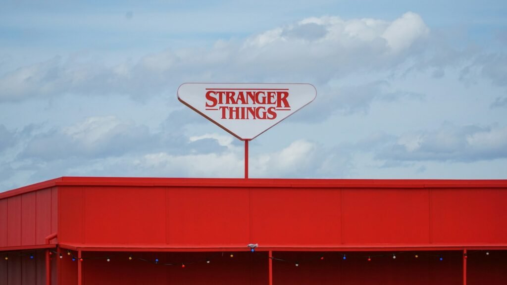
The Stranger Things logo is a custom wordmark. It uses a modified version of the ITC Benguiat typeface, rendered in outlined or glowing red letters on a black background. “STRANGER” sits above “THINGS,” with the first and last letters of the top line enlarged so they drop below the baseline. Horizontal rules and a subtle neon glow complete the retro-horror atmosphere.
How the Stranger Things Logo Was Created
The Duffer Brothers wanted the title sequence and logo to feel like the Stephen King paperbacks and 1980s genre films they grew up with. They referenced classic King covers and the work of title designer Richard Greenberg (known for Alien and other era-defining sequences).
Two design groups played key roles:
- Contend (art direction by Jacob Boghosian and Nate Sherman) developed the core logo treatment, exploring more than 20 options before settling on a customized version of ITC Benguiat.
- Imaginary Forces (led by Michelle Dougherty) refined the motion title sequence, adding the glowing red contours, film-grain texture, and the slow, monumental reveal of the letters.
The final mark deliberately echoes the oversized first and last letters seen on many 1970s–1980s Stephen King covers. That single structural choice immediately places the viewer in the correct cultural and emotional territory.
The Typography: ITC Benguiat
The foundation of the logo is ITC Benguiat, a decorative serif typeface designed by Ed Benguiat in 1977–1978 for the International Typeface Corporation. Benguiat created hundreds of typefaces and also worked on major logos and publication redesigns.
ITC Benguiat became closely associated with:
- Stephen King novel covers
- Choose Your Own Adventure books
- Certain 1980s album and movie packaging
For Stranger Things the typeface was not used straight out of the box. Designers adjusted contours, tightened spacing, vertically stretched characters, and enlarged the opening “S” and closing “R” of “STRANGER” so the two lines lock together more dramatically. The result feels custom while still triggering instant recognition of the era.
In the title sequence, the glowing red outlines are paired with secondary type set in ITC Avant Garde (designed by Herb Lubalin, Benguiat’s contemporary). The combination of the two ITC faces adds another quiet layer of 1970s–80s design history.
Design Analysis: Why the Logo Works
1. Instant cultural positioning
Before any character appears, the logo tells the audience what kind of story this is: 1980s, small-town, supernatural, slightly dangerous. Few modern title treatments achieve that much narrative work with pure typography.
2. Strong hierarchy and lockup
The stacked structure with oversized end letters creates a stable, poster-like composition. It feels like a book cover or a theatrical title rather than a generic streaming thumbnail.
3. High-contrast color strategy
Red on black delivers danger and visibility. The glow effect softens the edges just enough to suggest neon signs and aged print without reducing legibility.
4. Scalability and flexibility
The wordmark works in the full title sequence, on posters, apparel, social avatars, and small digital placements. The core structure remains clear even when the glow is simplified or removed.
5. Nostalgia without parody
The design references the past precisely enough to feel authentic, yet it is refined enough to feel contemporary. It avoids both pure pastiche and generic modern flatness.
These qualities — distinctive form, clear emotional signal, and disciplined execution — appear across other long-lasting marks we have examined, from the Star Wars logo to the Batman logo and even the aggressive simplicity of the Monster logo.
Evolution Across Seasons
The core wordmark has remained stable since 2016. Seasonal variations usually involve:
- Adding a large number (2, 3, 4…) integrated into the composition
- Adjusting glow intensity or texture to match the tone of the season
- Maintaining the same type structure and color relationships
This restrained approach protected recognition while still allowing each season to feel distinct — a useful model for any brand that needs continuity across multiple “versions” or product generations.
Brand Lessons for Modern Companies
1. Typography can carry the entire identity
Stranger Things proves a well-chosen and carefully customized wordmark can be as powerful as a pictorial symbol. Many SaaS and tech brands under-invest in distinctive lettering and over-rely on generic geometric icons.
2. Cultural references work when they are precise
The logo succeeds because the references (King covers, 1980s title design) are specific and coherent. Vague “retro” styling usually feels hollow.
3. Constraint creates strength
Limited colors, a single dominant type family, and a stable structure made the mark more memorable, not less. The same principle applies to effective logo design in any category.
4. Motion and static versions should feel related
The title sequence and the still logo share the same DNA. Brands that treat motion design as completely separate from the core mark often end up with fragmented identities.
5. Consistency compounds cultural value
Because the logo has stayed recognizable across years of the show, memes, merchandise, and marketing, it has accumulated meaning far beyond its original design brief.
When evaluating logo design services or refining an existing mark, these lessons remain highly relevant.
Practical Takeaways
- Choose type that already carries some of the emotional associations you need, then customize it so it feels owned.
- Test the logo both with and without effects (glow, texture, motion).
- Make sure the core structure works at small sizes and in single color.
- Protect the primary mark across seasons, campaigns, or product lines so recognition can compound.
- Align the logo with the broader visual and narrative world rather than treating it as an isolated graphic.
Bottom Line
The Stranger Things logo is a masterclass in using typography, color, and cultural reference to create instant atmosphere. By starting from Stephen King paperback covers and 1980s title design, then refining the details with care, the team produced a mark that feels inevitable in hindsight.
For brands in any sector, the enduring lesson is clear: a logo does not need to illustrate everything the company does. It needs to signal the right feeling, remain legible and distinctive, and stay consistent long enough for meaning to attach. The glowing red wordmark of Stranger Things continues to demonstrate exactly how powerful that combination can be.
About the Author
Written by the TechAndSaaS editorial team. We research and document practical systems that help SaaS founders and operators scale without proportional headcount growth. Our content is based on real implementation patterns observed across early-stage and growth-stage SaaS companies in 2025–2026. We focus on clear frameworks, measurable outcomes, and honest trade-offs — not hype.
