Monster Logo – History, Claw Meaning, Design Analysis & Brand Lessons (2026)
Monster Logo: The Full History, Design Meaning & Why It Never Changed
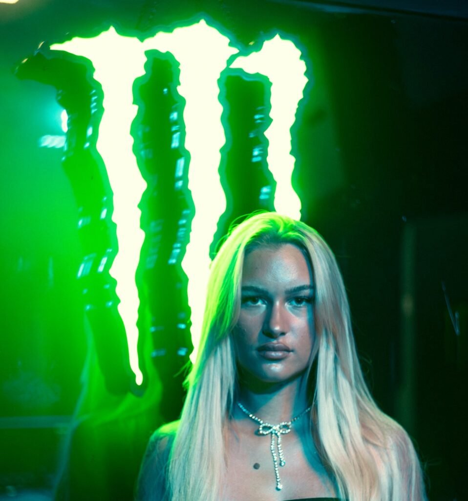
The Monster logo is one of the most aggressive and recognizable marks in consumer packaging. Three neon-green claw strokes form a jagged “M” that looks like something tore through the can from the inside. Since the drink launched in 2002, the core symbol has remained essentially unchanged — a rare case of a brand deciding early that it had already found its visual identity and then protecting it for more than two decades.
This guide goes deeper than typical logo-history roundups. It covers how the mark was created, what the designers actually intended, why conspiracy theories about “666” do not hold up, how the logo performs as a brand asset, and the practical lessons SaaS and tech companies can take from its discipline and clarity.
Quick Answer: What Is the Monster Logo?
The Monster logo is a pictorial + letterform hybrid: three vertical, jagged neon-green claw marks that together read as a capital “M.” It sits on a black background and is usually paired with the wordmark “MONSTER ENERGY.” The design was created to feel raw, aggressive, and immediately different from the cleaner, more illustrative energy-drink brands that dominated the market at the time.
How the Monster Logo Was Created
Monster Energy was launched in April 2002 by Hansen Natural (later renamed Monster Beverage Corporation). The company wanted a product that could compete with Red Bull by targeting a more aggressive, action-sports, and youth-oriented consumer.
The logo and packaging were designed by McLean Design, a California branding and packaging firm. According to accounts from the agency and later interviews, the creative direction was deliberate:
- Avoid cute or literal monster mascots (other drinks were already using animals and cartoon creatures).
- Create something that felt dangerous and unfinished rather than polished and corporate.
- Make the mark feel like evidence of a force rather than a picture of a character.
The decisive insight was simple: “The scariest monster is the one you never see.” Instead of drawing a creature, the designers made claw marks that implied the creature had already been there. One of the designers made a three-finger clawing motion and the team turned that gesture into the jagged “M.” Early testing with convenience-store customers reportedly favored the black can with the green claws over safer alternatives.
The result launched with the product and has stayed the primary brand mark ever since.
Design Breakdown: Why the Claw “M” Works
1. Instant storytelling without illustration
The claws suggest violence, energy, and release without showing a monster. The viewer completes the story. This is more memorable than a literal mascot and scales better across cans, apparel, vehicles, and digital icons.
2. Perfect category differentiation
In the early 2000s most energy drinks used bright, busy, or playful packaging. Monster’s black can and neon claw mark felt darker, louder, and more rebellious. That contrast helped it own a distinct position.
3. High contrast and visibility
Neon green on black is extremely high-visibility on shelves, in motion, and in low light. The mark remains clear even when reduced or viewed at a distance.
4. Dual function as symbol and letter
The claws form an “M,” so the mark works both as a pure icon and as a monogram. This gives it flexibility that pure pictorial logos sometimes lack.
5. Texture and attitude in the details
The strokes are not clean geometric lines. They have torn, uneven edges that reinforce the idea of something being ripped open. That small decision keeps the logo from feeling corporate or generic.
These qualities — distinctive silhouette, strong contrast, and clear personality — are the same traits that make other long-lasting marks such as the Batman logo, the Star Wars logo, and the Apple logo so effective.
The “666” Conspiracy Theory — and Why It Is Wrong
A persistent internet claim argues that the three claw marks are the Hebrew letter Vav repeated three times, and that Vav has the numerical value of 6, therefore the logo secretly spells “666.”
This theory does not hold up under scrutiny:
- The designers and the company have consistently stated that the mark represents claw scratches forming an “M.”
- The strokes are designed with torn, irregular edges consistent with claw marks, not formal Hebrew calligraphy.
- Fact-checking organizations have rated the claim false.
- Treating every set of three vertical marks as a coded religious reference is pattern-seeking, not evidence.
The logo’s actual meaning is far more straightforward and more useful for brand strategy: it is a visual expression of the name and the slogan “Unleash the Beast.”
Why the Monster Logo Has Never Been Redesigned
Most brands redesign their logos multiple times in twenty years. Monster has not. Several practical reasons explain the decision:
- The mark was already strongly differentiated from the start.
- It performed well on the physical product (the can is the primary advertising surface).
- It transferred cleanly onto sponsorships, athlete apparel, vehicles, and events.
- Recognition and cultural association compounded every year it stayed consistent.
- Changing it would have risked diluting one of the brand’s strongest assets.
This is a classic example of protecting a working mark rather than redesigning for the sake of novelty — a principle we emphasize throughout our guides on logo design and choosing logo design services.
Brand Lessons for SaaS, Tech, and Consumer Companies
1. Attitude can be a positioning tool
Monster did not try to look safe or broadly appealing. It chose a specific emotional territory and committed to it visually. Many SaaS logos aim for generic “trustworthy tech” and end up invisible.
2. Implication often beats illustration
Showing the effect (claw marks) was stronger than showing the cause (a monster). Abstract or suggestive marks frequently age better and scale more cleanly than literal ones.
3. Consistency is a competitive advantage
By refusing to tinker with the core symbol, Monster allowed recognition and meaning to accumulate. Brands that redesign every few years often reset that equity.
4. Design for the primary surface first
The logo was built to dominate a black 16-oz can. Knowing the most important real-world context shaped better decisions than designing in isolation on a blank artboard.
5. A strong mark supports the entire system
The claw “M” works on product, sponsorship, digital, and merchandise because it is simple, high-contrast, and distinctive. The same tests apply whether you are building an energy drink or a SaaS product.
Practical Takeaways You Can Apply Immediately
- Test your logo as a pure silhouette and in single color.
- Ask whether it still works on your most important physical or digital surface.
- Prefer marks that suggest personality over marks that try to illustrate every attribute of the business.
- Once a logo is performing, resist cosmetic redesigns that do not solve a real recognition or usability problem.
- Make sure the logo and the rest of the brand experience (website, product, messaging) feel like they belong to the same company.
Bottom Line
The Monster logo succeeds because it is simple, aggressive, highly distinctive, and has been protected with unusual discipline. Three claw marks forming an “M” on black created an instant visual position that the brand has owned for more than twenty years.
For modern companies, the lasting lesson is not “make something edgy.” It is this: find a clear, differentiated visual idea that works in the real contexts your brand actually lives in, then have the confidence to leave it alone long enough for recognition and meaning to compound.
That approach has served Monster exceptionally well — and it remains one of the clearest case studies in focused, long-term logo strategy.
About the Author
Written by the TechAndSaaS editorial team. We research and document practical systems that help SaaS founders and operators scale without proportional headcount growth. Our content is based on real implementation patterns observed across early-stage and growth-stage SaaS companies in 2025–2026. We focus on clear frameworks, measurable outcomes, and honest trade-offs — not hype.
