Batman Logo – History, Design Evolution & Brand Lessons (2026)
Batman Logo: History, Design Evolution & Brand Lessons
The Batman logo — most often recognized as the bat symbol inside an oval or as a standalone bat silhouette — is one of the most enduring marks in popular culture. It has remained identifiable for decades while undergoing controlled changes across comics, television, film, and merchandise. Its longevity offers clear lessons in distinctiveness, adaptability, and disciplined brand evolution.
This guide covers the design history of the Batman logo, why the core symbol works, how it has changed, and what SaaS, tech, and consumer brands can learn from it.
Quick Answer: What Is the Batman Logo?
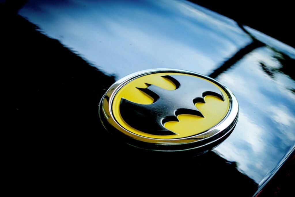
The Batman logo is primarily a pictorial mark: a stylized bat silhouette. Over time it has appeared both as a standalone bat and as a bat shape contained within a yellow oval (the version most associated with the classic comic and the 1989 Tim Burton film). The strength of the mark lies in its strong silhouette, high contrast, and immediate recognizability even at small sizes.
Origin and Early Design
The bat symbol first appeared in Detective Comics in the late 1930s and early 1940s. Early versions were simpler and less standardized than the marks audiences know today. Over the following decades, artists refined the wingspan, ear shape, and overall proportions.
Key early developments:
- The bat silhouette became the central identifier for the character
- Yellow oval versions emerged and gained strong association with the comics
- The symbol was used both as a chest emblem and as a standalone logo for titles and merchandising
Unlike purely typographic logos, the Batman mark is iconic — its power comes from shape rather than lettering.
Why the Batman Logo Works
1. Instantly readable silhouette
The bat shape is distinctive even when reduced to a few pixels or printed in single color. Strong silhouettes are one of the most reliable features of long-lasting pictorial logos.
2. High contrast and scalability
Black bat on yellow (or the reverse) creates immediate visibility. The mark performs across comics, film posters, toys, apparel, and digital avatars.
3. Controlled flexibility
Different eras have adjusted wing shape, ear length, and oval presence while protecting the core idea of “bat.” This balance between consistency and adaptation is difficult to achieve and highly valuable.
4. Emotional and narrative association
The symbol carries decades of meaning — justice, fear, night, dual identity — without needing explanatory text. The design quality allowed that meaning to transfer cleanly onto products and marketing.
5. Works with or without supporting elements
The bat can stand alone or sit inside an oval. Both versions remain recognizable, giving the brand system useful flexibility.
These traits align with the core principles of effective logo design: distinctive form, scalability, and clarity.
Major Evolutions of the Batman Logo
- Golden and Silver Age comics — Establishment and refinement of the bat shape; yellow oval versions become prominent
- 1970s–1980s comics and merchandising — Continued variation in wing and ear details while protecting recognition
- 1989 Tim Burton film — The black bat in a yellow oval became a massive global mainstream symbol
- 1990s–2000s films and animated series — Darker, more angular, or simplified treatments matched the tone of each project
- Christopher Nolan era — More textured, fragmented, or etched interpretations while keeping the bat readable
- Recent films, games, and series — Ongoing adjustments in style and finish, with the core silhouette still protected
The pattern is consistent: the underlying idea remains stable while surface treatments adapt to tone and medium. This is similar to how other major entertainment marks, such as the Star Wars logo, have preserved core structure across decades of change.
Brand Lessons for Modern Companies
1. Silhouette is a competitive advantage
If your logo collapses when turned into a single-color shape or reduced to a small icon, it is weaker than it appears. The Batman symbol remains clear in the most demanding conditions.
2. Evolution is safer than constant reinvention
Batman branding has changed, but it has rarely abandoned the core bat idea. Brands that fully redesign too often reset the recognition they have already earned.
3. One strong mark can support many expressions
The same bat symbol has worked for comics, dark films, animated series, and consumer products. A clear core mark gives teams room to adapt without starting over.
4. Pictorial marks need the same discipline as wordmarks
Whether you use a symbol (like Batman or the Apple logo) or a wordmark, the tests are the same: distinctiveness, scalability, single-color performance, and long-term usability.
5. Meaning accumulates through consistent use
The bat symbol is powerful partly because it has been protected and repeated across decades. Consistency allowed cultural meaning to attach to the design.
When commissioning or refining a mark, these principles should guide both internal decisions and conversations with logo design services.
Common Mistakes When Applying These Lessons
- Copying the bat shape too closely (legal and brand-confusion risks)
- Assuming any dark or aggressive symbol will automatically feel premium
- Changing the core shape so frequently that recognition erodes
- Ignoring small-size and single-color performance
- Treating the logo as a substitute for coherent product and brand experience
Practical Checklist Inspired by the Batman Logo
Before finalizing a logo, test:
- Does it read clearly as a silhouette?
- Does it work at favicon and app-icon sizes?
- Does it remain strong in one color?
- Is the core idea stable enough to support future stylistic variations?
- Would it still be recognizable if the supporting text or oval were removed?
- Does it feel distinctive within its category?
These checks reinforce the standards covered in our full logo design guide.
Bottom Line
The Batman logo demonstrates how a simple, distinctive pictorial mark can remain powerful across decades of cultural and stylistic change. Its strength comes from a clear silhouette, high contrast, controlled evolution, and consistent use.
For SaaS and tech brands, the practical takeaway is the same: build a mark that is recognizable on its own, scalable across every surface, and stable enough to accumulate meaning. Then adapt surface treatments carefully rather than reinventing the core identity with every campaign or product generation.
About the Author
Written by the TechAndSaaS editorial team. We research and document practical systems that help SaaS founders and operators scale without proportional headcount growth. Our content is based on real implementation patterns observed across early-stage and growth-stage SaaS companies in 2025–2026. We focus on clear frameworks, measurable outcomes, and honest trade-offs — not hype.

Pingback: Monster Logo – History, Claw Meaning, Design Analysis & Brand Lessons (2026) – Tech And SaaS